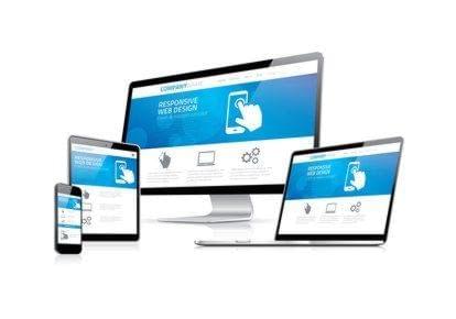
02 Apr Mobile-Friendly Websites Provide A Better User Experience


Mobile-friendly websites provide a better user experience to customers. When was the last time you searched for products or services from your mobile device? Did you notice some websites retrofit to mobile devices while others do not? Chances are you’ve done a mobile search for something on your phone or tablet in the last 24 hours. If you were able to easily maneuver the website on your mobile phone, you probably stayed on the site. If the site wasn’t mobile-friendly, you may have moved on! Having a mobile responsive design is essential today.
Google has been focusing on delivering the best possible user experience on mobile devices. You may have seen the words “mobile-friendly” next to sites when doing a search from your mobile phone. As of April 21, 2015, Google has announced it will use mobile-friendly websites as a significant ranking factor. Do you have a mobile-friendly website? That’s the big question.
Mobile-friendly websites will improve your search engine results, give you a competitive advantage and enhance the overall user experience. Mobile-friendly websites often load faster as well. You can create internet ads for mobile-friendly websites that scale to mobile device specifications. You might even consider running ads on popular apps or non-competing business websites that are mobile-friendly.
If you do not have a mobile-friendly website by now, it should be a goal in the near future. Hopefully, you have updated your website with relevant content. My Google rep has drilled the word relevancy into my brain. It’s all about providing the end user with results that are relevant to their search.
For example, if a customer is searching for laminate wood flooring, does your website have a page devoted to various types of laminate wood flooring? If you feature specific pages on your website relevant to a search query that’s great. If your website is mobile-friendly, that’s even better. Have you kept your social media platforms and blog up-to-date? If so, you’re doing awesome.
Having your own mobile-friendly website is key. I’ve met business owners over the last few years that have used Facebook to market their products or services in lieu of having a website. I have seen entrepreneurs use websites such as Wix and ReverbNation to get a website presence. I can say this with confidence. There is nothing like having your own website and being able to access marketing professionals and website developers that can create your exact vision!
Other sites may come and go! Third-party website vendors may implement changes that don’t necessarily benefit your business. Having a mobile-friendly website of your own is the way to go! Invest and reinvest in your own mobile-friendly website. It’s the main hub to tell your story and make a connection to potential customers.
Once you’ve conquered a mobile-friendly website, focus on building a mobile app if you haven’t done so already. How many apps have you used this week? See the trend! Lay your tracks. In the meantime, sign up for a Google Webmasters account to help your website stay Google-friendly.
Sorry, the comment form is closed at this time.